| View unanswered posts | View active topics |
It is currently Mon Jun 29, 2026 11:21 pm |
|
All times are UTC [ DST ] |
|
|
Page 498 of 537 |
[ 8043 posts ] | Go to page Previous 1 ... 495, 496, 497, 498, 499, 500, 501 ... 537 Next |
| Print view | Previous topic | Next topic |
Art Dump
| Author | Message |
|---|---|
|
Data Realms Elite  Joined: Mon Oct 12, 2009 11:19 pm Posts: 797 Location: The Netherlands |
robolee wrote: I think you need to be less sketchy and use more opaque lines, but it's not bad, keep going. Thanks for the comments, I konw what you mean and agree. I think I'm still pretty bad at deliberate line placement and colour blending. When I try to work fast (those last two f.e.) it often becomes muddy like that. Usually I'd then go in and paint over/refine it, but that still takes me longer than I'd like. Sweet landscape madmax, nice colour and lighting. I think the perspective is a bit off, with the river in the distance? It could be going downards though. |
| Fri Jun 07, 2013 3:14 pm |
|
|
Data Realms Elite  Joined: Tue May 25, 2010 8:27 pm Posts: 4522 Location: Constant motion |
That mountain also seems a little flat, great work though.
|
| Fri Jun 07, 2013 3:50 pm |
|
 Joined: Sun Apr 22, 2007 8:01 pm Posts: 378 Location: Nomadic |
Thanks for the feedback guys, I decided to work on it a little more, tried to pop the mountain with some shadow, added some distant foggy hills, road and a few little things to help unlame-ify the foreground.
Adriaan, I was kinda unclear on your comment, I can't really see the perspective issue with the river. |
| Sun Jun 09, 2013 2:07 am |
|
 Joined: Tue Oct 13, 2009 4:23 pm Posts: 915 Location: Blighty |
Something I've always liked about your work Max, is the sharpness, even on smaller scales.
|
| Sun Jun 09, 2013 3:06 am |
|
|
Joined: Sun Apr 22, 2007 8:01 pm Posts: 378 Location: Nomadic |
Very glad to hear, Matty. Thanks.
|
| Sun Jun 09, 2013 3:15 am |
|
|
Forum Moderator  Joined: Fri Feb 02, 2007 3:53 pm Posts: 1896 Location: in my little gay bunker |
Awww goddamn MadMax, why'd you remove the other one. I'd have liked to see the differences.
|
| Sun Jun 09, 2013 5:50 am |
|
|
Joined: Sun Apr 22, 2007 8:01 pm Posts: 378 Location: Nomadic |
Oh, oops, I deleted it from my Imageshack account to save space. It wasn't a big edit though.
|
| Sun Jun 09, 2013 3:37 pm |
|
|
Joined: Tue Oct 13, 2009 4:23 pm Posts: 915 Location: Blighty |
 Working on a Kerbal |
| Tue Jun 11, 2013 8:29 pm |
|
 Joined: Thu May 05, 2011 1:30 am Posts: 2876 Location: Rent free in your head. Vacation in your ass. |
 At least it ain't a stick figure. |
| Wed Jun 12, 2013 1:13 am |
|
|
Joined: Sun Apr 22, 2007 8:01 pm Posts: 378 Location: Nomadic |
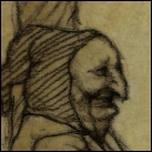
Royal Guard concept
 Same armor, just changed the halberd.  Some other stuff   |
| Thu Jun 13, 2013 5:14 pm |
|
 Joined: Mon Jan 25, 2010 11:35 pm Posts: 675 |
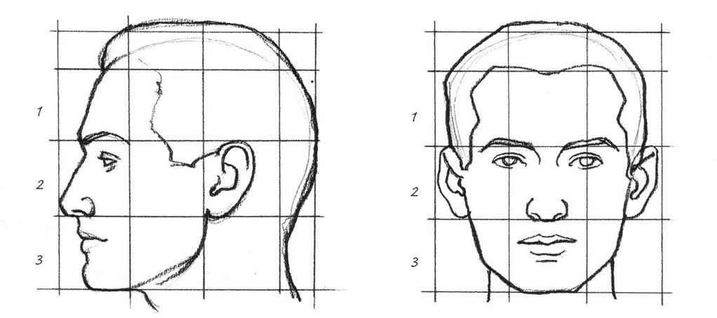
My first attempts at drawing human faces. If anybody could give me some constructive criticism or tips, I'd really appreciate it.
Last edited by David Rodrigov on Thu Jun 20, 2013 9:57 pm, edited 1 time in total. |
| Wed Jun 19, 2013 1:18 am |
|
|
Joined: Sun Apr 22, 2007 8:01 pm Posts: 378 Location: Nomadic |
The individual facial features generally aren't bad at all but they all suffer from bad placement, incorrect spacing, and generally bad proportions. I would study up on the general proportions of the head and the facial features(see below for a good reference). Don't even bother with shading until you're pretty confident with the proportions.
|
| Wed Jun 19, 2013 4:39 am |
|
 Joined: Sat Oct 09, 2010 10:01 am Posts: 303 Location: Afrique d' Sud |
Hello! Been a while.
Anyways. All school assignments. Spoilered for HUGE. Also, oldest first, most recent last (Which I finished yesterday). |
| Thu Jun 20, 2013 11:58 am |
|
|
Joined: Sun Apr 22, 2007 8:01 pm Posts: 378 Location: Nomadic |
Last three are great, first few are kinda weird and lack contrast.
Some facial expression practice, 2 ref'd, 2 from imagination  |
| Fri Jun 21, 2013 1:16 am |
|
|
Joined: Sun Apr 22, 2007 8:01 pm Posts: 378 Location: Nomadic |
Hehe, he does have a bit of a smug grin to him.
|
| Fri Jun 21, 2013 2:06 pm |
|


|
|
Page 498 of 537 |
[ 8043 posts ] | Go to page Previous 1 ... 495, 496, 497, 498, 499, 500, 501 ... 537 Next |
|
All times are UTC [ DST ] |
Who is online |
Users browsing this forum: No registered users |
| You cannot post new topics in this forum You cannot reply to topics in this forum You cannot edit your posts in this forum You cannot delete your posts in this forum You cannot post attachments in this forum |