| Author |
Message |
|
Bombzero
Joined: Sat May 19, 2012 9:27 pm
Posts: 364

|
 Re: Art Dump Just finished this after sketching the original and deciding I wanted to color it.  on an interesting note I have upgraded from abhorent line sketches to early 2000's Flash style apparently, seeing as how that has been the remark on how my work looks with my newer stuff, not sure when this happened.
|
| Thu Aug 16, 2012 10:48 am |

|
|
|
Miggles
Data Realms Elite
Joined: Mon Jul 12, 2010 5:39 am
Posts: 4558
|
Re: Art Dump ..eugh.
It's very simple, bent in parts, and the coloring is just a 2-way gradient.
It looks way too smooth, and really, really ugly. Try uh, not using the gradient effect/shader/tool of any kind when you color.
|
| Thu Aug 16, 2012 2:18 pm |

|
|
|
CrazyMLC
Joined: Fri Dec 22, 2006 4:20 am
Posts: 4772
Location: Good news everyone!
|
Re: Art Dump
|
| Thu Aug 16, 2012 3:13 pm |
|
|
|
Adriaan
Data Realms Elite
Joined: Mon Oct 12, 2009 11:19 pm
Posts: 797
Location: The Netherlands
|
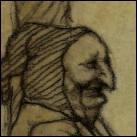
Re: Art Dump madmax wrote: Excellent work, Adriaan, that's a difficult expression to capture. I like the texture you applied. I think that some of the shadows are a little too soft on the sides of his face, where the strong light turns sharply to shadow in the reference, yours seem to blur. His teeth look a tad flat as well (remember sets of teeth are cylindrical). Good job overall. Thanks for the crits and nice one on the teeth, I'll keep that in mind. I see what you mean with the shadows as well, they do look a bit blurry in places.
|
| Thu Aug 16, 2012 5:24 pm |
|
|
|
Bombzero
Joined: Sat May 19, 2012 9:27 pm
Posts: 364
|
Re: Art Dump Miggles wrote: ..eugh.Try uh, not using the gradient effect/shader/tool of any kind when you color. I didn't. the program I use doesn't even have a gradient tool, in fact I used the exact same method I used on the last image I uploaded here.
|
| Thu Aug 16, 2012 7:22 pm |
|
|
|
Miggles
Data Realms Elite
Joined: Mon Jul 12, 2010 5:39 am
Posts: 4558
|
Re: Art Dump You know what I mean.
However you managed to shade that, don't use the same technique ever for anything unless you want it to look awful.
|
| Thu Aug 16, 2012 7:27 pm |
|
|
|
madmax
Joined: Sun Apr 22, 2007 8:01 pm
Posts: 378
Location: Nomadic
|
Re: Art Dump Bombzero wrote: early 2000's Flash style Oh god, the memories, all those castle defense flash games. But yeah, the subtle gradient shading is really funky, kinda makes things look like plastic rather than wood or steel. Try using a harder brush or more contrasting values.
|
| Thu Aug 16, 2012 10:04 pm |
|
|
|
Bombzero
Joined: Sat May 19, 2012 9:27 pm
Posts: 364
|
Re: Art Dump Miggles wrote: You know what I mean.
However you managed to shade that, don't use the same technique ever for anything unless you want it to look awful. You certainly are a negative person, just saying.
|
| Fri Aug 17, 2012 5:48 am |
|
|
|
Metal Chao
Joined: Sat May 05, 2007 6:04 pm
Posts: 2901
|
Re: Art Dump No matter how it is framed you should take his advice, shading like that is an easy habit to fall into and a bad one to do.
Gradient shading (that is what it is, even if you didn't use a gradient tool) is both unappealing and unrealistic. You need to make sure you have a clear light source and make less use of whatever dodge/burn tool or transparent brush you have been using.
|
| Fri Aug 17, 2012 6:00 am |
|
|
|
Bombzero
Joined: Sat May 19, 2012 9:27 pm
Posts: 364
|
Re: Art Dump metal chao wrote: No matter how it is framed you should take his advice, shading like that is an easy habit to fall into and a bad one to do.
Gradient shading (that is what it is, even if you didn't use a gradient tool) is both unappealing and unrealistic. You need to make sure you have a clear light source and make less use of whatever dodge/burn tool or transparent brush you have been using. Yes but typically people aiming to offer helpful advice and not just be rude/trolling tend to actually... offer helpful advice, not say "it sucks, don't do it again." Now im presuming Miggles didn't intend to be rude/troll but it would be nicer if when critiquing somebodies second colored drawing they have ever made to offer a positive alternative to the thing you have a problem with. EDIT: on a side note would anybody care to help me figure out why the first colored image and the second one have a severe gap in quality? im assuming its because in the first one i actually had a light source that wasn't ambiguous.
|
| Fri Aug 17, 2012 6:16 am |
|
|
|
TorrentHKU
Loose Canon
Joined: Sun Mar 29, 2009 11:07 pm
Posts: 2992
Location: --------------->
|
Re: Art Dump Pretty much that, yeah.
Lightning makes a lot of difference.
|
| Fri Aug 17, 2012 6:19 am |
|
|
|
Metal Chao
Joined: Sat May 05, 2007 6:04 pm
Posts: 2901
|
Re: Art Dump Honestly the first one could have done with a lot more contrast too and what shading you have doesn't exactly make sense.
Everything on the body seems to be a curved plane even when it shouldn't be and shading with a white light source makes things look a little unnatural. Try shifting your hue at the same time as the luminosity.
You even have patches of light just appearing in the middle of nowhere!
Try and consider where contours would be on the body (such as between those plates you have that you have shaded as a single shape with outlines drawn across it) and shade there, and don't go overboard!
|
| Fri Aug 17, 2012 6:28 am |
|
|
|
Lizardheim
DRL Developer
Joined: Fri May 15, 2009 10:29 am
Posts: 4107
Location: Russia
|
Re: Art Dump Flat two color shading beats gradient shading by ∞.
|
| Fri Aug 17, 2012 2:11 pm |
|
|
|
Bombzero
Joined: Sat May 19, 2012 9:27 pm
Posts: 364
|
Re: Art Dump Lizardheim wrote: Flat two color shading beats gradient shading by ∞. this is a good tip I suppose, the main issue is the skill difference required to make gradient shading look good, as you basically have to have a very good knowledge of how lighting, different materials, different textures, and contours work in the real world, more so then normal people would.
|
| Fri Aug 17, 2012 2:17 pm |
|
|
|
CrazyMLC
Joined: Fri Dec 22, 2006 4:20 am
Posts: 4772
Location: Good news everyone!
|
Re: Art Dump Dorothy Ainsworth wrote: You are smarter and more capable than you think. You can't learn if you don't try. If a task looks daunting, get started anyway. Take it one step at a time. Dream big but take baby steps. Write down a plan. List your priorities. Number them. Start in with whatever it takes to get started.
|
| Fri Aug 17, 2012 2:29 pm |
|
|
|
Who is online |
Users browsing this forum: No registered users |
|
You cannot post new topics in this forum
You cannot reply to topics in this forum
You cannot edit your posts in this forum
You cannot delete your posts in this forum
You cannot post attachments in this forum
|

|